2. How effective is the combination of your main product and ancillary texts?
For our ancillary task we had to do two of the following 3:
- a website homepage for the band;
- a cover for its release as part of the digipak (CD/DVD package);
- a magazine advertisement for the digipak (CD/DVD package).
As a group we decided that we would do an album cover for the release of our music video. Along with the album cover, we chose to do a magazine advertistment for our digipak.
Narrative
An important convention in the creation of music videos is narrative. This convention is particularly important as the audience need to be able to understand and get the general idea of what is going on in the music video via language, visuals etc.
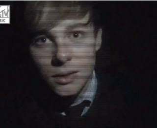
The opening scene of our music video sees Jake our actor with his eyes closed, as though in a dream or in deep thought. The overlay of Jake and Emily together further enhances this idea of a dream or deep thought. As Jake's eyes open, it is as though he has come back to reality. We as a group felt that continuity is very important when making both the music video and our digipaks. Given these views of continuity, our digipak front cover is of Jake with his eyes closed which interlinks both the video and the digipak together.


Our actor Jake had to portray traits of anger, regret, confusion, sadness, which are typical themes in our target audience. The way in which we convey these themes are by our actors gestures throughout the music video. We also used strobe lighting effects to highlight an element of confusion in the audience and also to show a state of flux or change in the music video. In our Digipak we used images of our close up's to create an image of a cover in our Digipak. The close ups in the video portray the relationship in our actors. There were also uses of overlays which showed our actor Jake cutting his arm over the lyric 'If your right arm is causing you pain, cut it off ..'. We felt it necessary to add on this overlay to portray his sadness, anger and confusion.
Lighting
One style that we felt would fit in perfectly with our target audience was the use of dark lighting across all three mediums. One of the main aspects of lighting in our music video was the strobe lighting effects. Our feedback commented a lot on the use of the strobe lighting effect and how it was there favorite aspect of the music video and really stood out.
The use of strobe lights were not used by any other group in our year and this was picked up on in our feedback, making our music video stand out. Our magazine poster image are several shots taken from our chorus where the strobe lighting is in full effect. That was the link between our ancillary task and our main task. The image on the poster works very well, as anyone who has seen the video would be able to identify that the images used on the poster were taken from our music video.
We used the element of strobe lighting effects, as we knew it would appeal to our target audience of 18-25 year olds who are accustomed to this type of lighting due to knowledge of the club scene. The font of our magazine poster and our album cover was very important, as we wanted to emulate Bloc Party's house style. The font 'Code Light' was downloaded from Dafont.com and was the closest possible font we could use to emulate that of Bloc Party.
Main Promotional image
 |
| Bloc Party's Font |
 |
| Our poster font |
 |
| Our CD cover font |
Main Promotional image
A cyclical idea was suggested for our album cover which in turn creates a house style of its own. The main image or front cover of our album cover was that of Jake our actor with his eyes open in a close up frame. At the back of the album cover is an image of Jake with his eyes closed which was the cyclical design than we had agreed on using.
The links between all 3 platforms:
- We used images from our music video and placed them into both our album cover and our magazine poster which if viewed by its audience would automatically be able to relate the images with the music video.
- The focus on our main character Jake was important across all three platforms. He was a central element in images we used in our album cover and magazine poster. The images of Jake were taken from our music video.
There were several elements that we changed throughout the creation of our music video. The location was very important in the filming of our music video and was originally filmed in Camden Town. But due to atmosphere and expenses, the location needed to change. When changing our location, we decided it was best to stay locally e.g. Dartford, Longfield. We also changed the concept of a narrative video but instead made it both narrative and performance based.


No comments:
Post a Comment