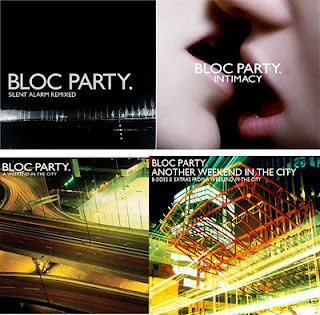
Myself and Sophie were put in charge of gathering research for our digipak whilst Emily and Victoria were editing our music video rough cut. Our aim was to look into previous digipaks made by Bloc Party which is our chosen band. What we were looking for were any coherent house styles in the digipaks that we as a group could emulate. We also wanted to compare Bloc Party's digipak with digipaks made by other bands within the same genre.
 |
| Compilation of Bloc Party's Digipaks |
Myself and Sophie discovered that in all four digipak's featured on Bloc Party's albums, the one coherent house stlye that struck us immediately was the font they used when writing the name "Bloc Party." which is written in white block capitals for it to stand out. We feel that is is essential to continue this house style for our own digipak.
Analysis of Bloc Party Digipak's
The first of their digipak's is an image of night time scenery. The white trees in the background of the image gives us an idea of winter time due to the snow like conditions being created. The title "Silent Alarm" seems to work well with the image due to the dark and night time scenery.
The second of the digipak's, "Intimacy" has a image of an extreme close up of two people about too kiss one other. We weren't able to distinguish the gender of both these characters. The title of the album "Intimacy" fits perfectly with the image of two people kissing and being intimate.
The final album on the bottom left hand side of the image above titled "A Weekend In the City" is an aerial shot of highway/motorway. The lighting used for this image makes it stand out amongst other album covers out there on the shelves. The highway/motorway and the title "A Weekend In the City" highlights a journey or trip to the city.
What we did next!!
After doing our research into the digipak's made by "Bloc Party", our first thought was to try and find a similar font which would emulate a similarity to that of "Bloc Party". The first place that we looked was "Dafont.com", which myself and Sophie were familiar with as we had used this website for our AS coursework. Thankfully, we found a similar font to that of "Bloc Party's". The name of the font was, "A beat by Kai". We downloaded the font and put it on a potential image we may use for our digipak.
We looked through our pictures we took whilst filming and found one that we felt was perfect for our Digipak. Because we want to continue the house style that block party use, we thought that it'd be a good idea to use an image of scenery for our Digipak.
 |
| Unedited image(Before Photoshop) |
 |
| Screen grab of the image being edited in Photoshop |


No comments:
Post a Comment